Primaxis
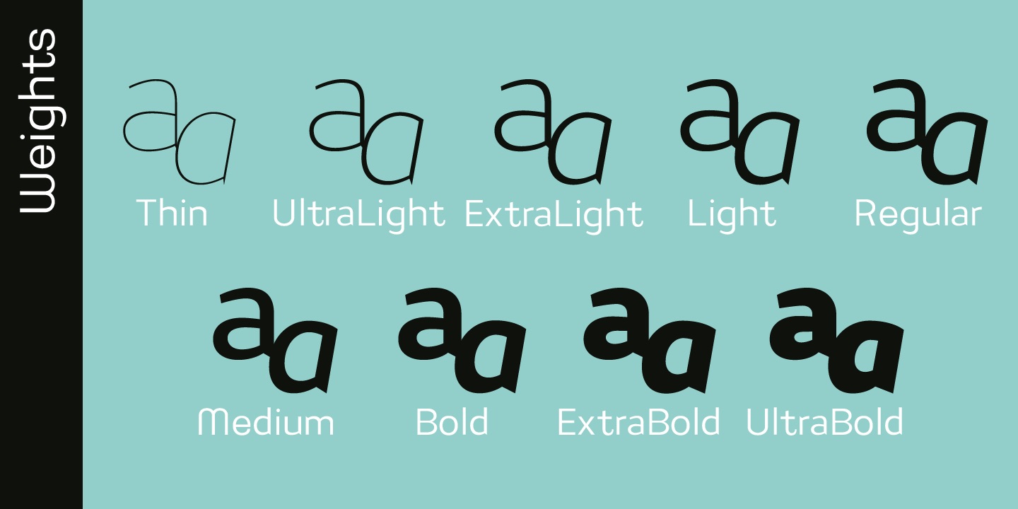
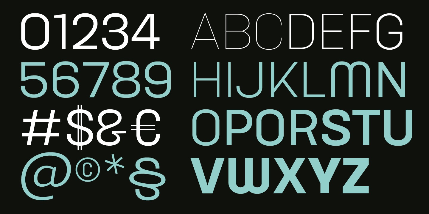
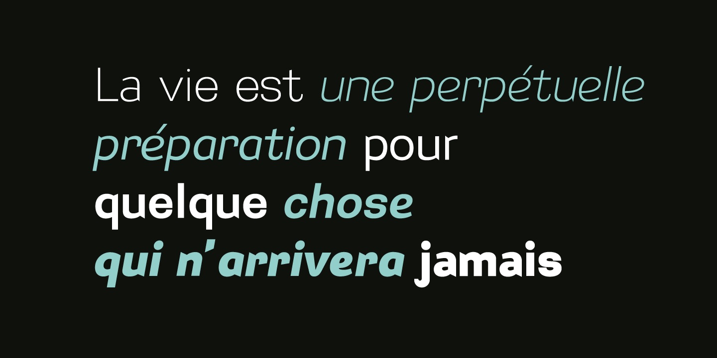
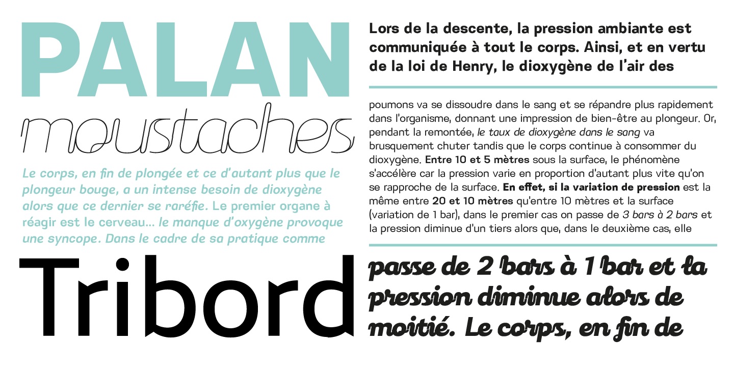
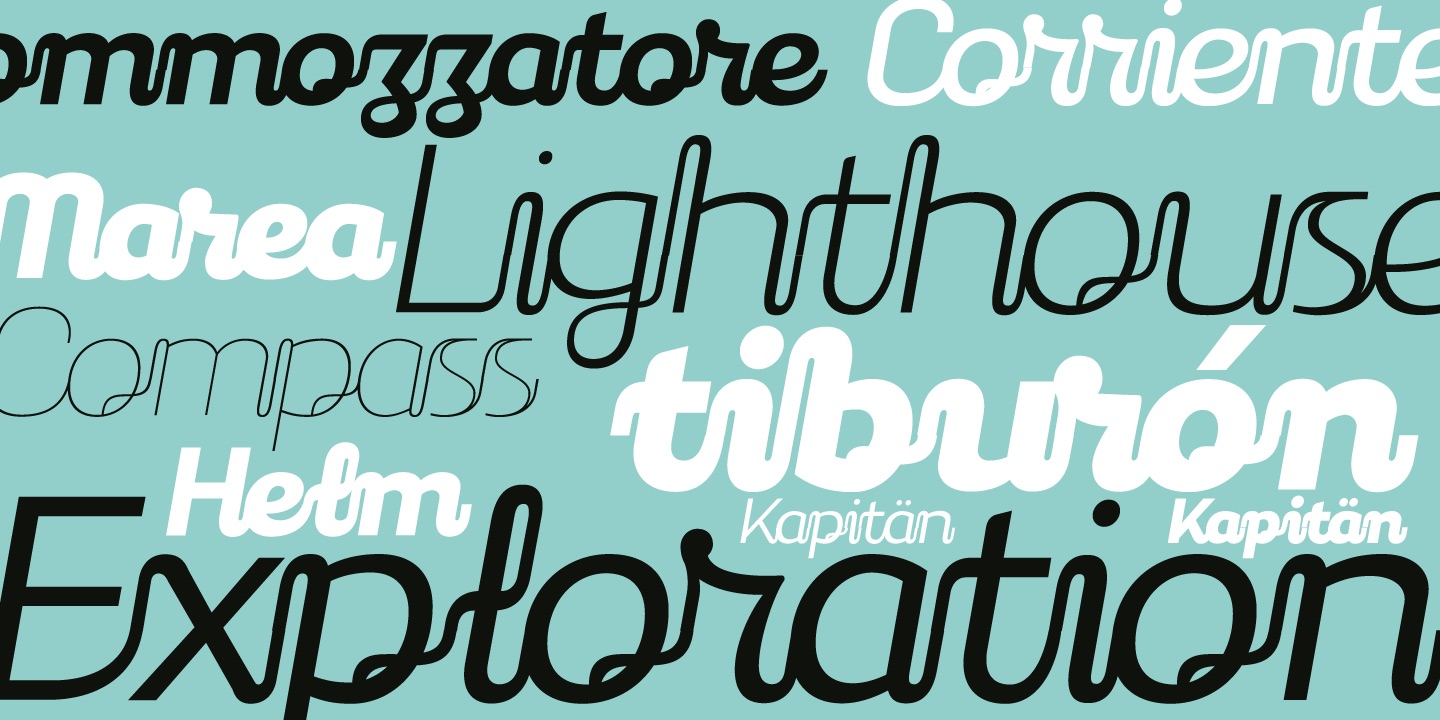
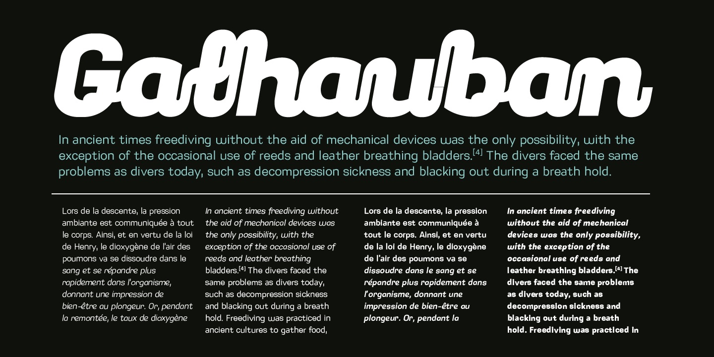
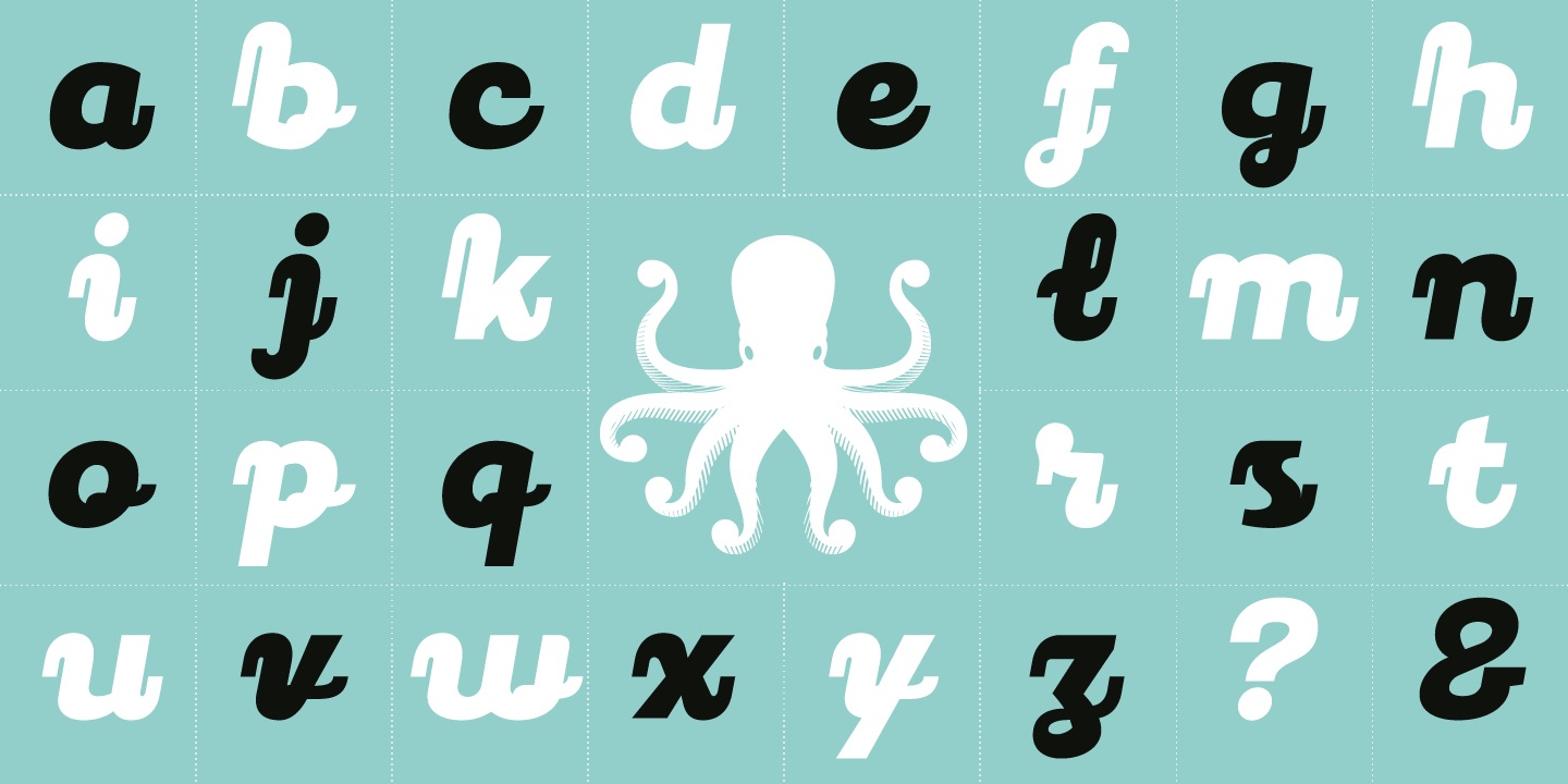
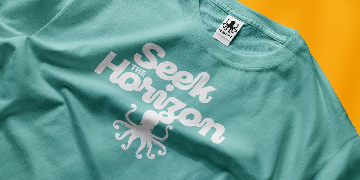
Primaxis derives its name from its foundational structure — a fundamental geometry that embodies the essence of the type family. Built on a rational skeleton, it showcases an elementary architecture, complemented by smooth curves and open counters that significantly enhance readability and visual rhythm. Designed as an expressive and versatile type family, Primaxis unfolds in three complementary styles: Roman, Italic, and a fluid Script, making it ideal for headlines, signatures, and logotypes. By merging geometric structure with a sense of motion and warmth, Primaxis seamlessly integrates into editorial, branding, and institutional contexts, providing a typeface that feels both contemporary and humanly crafted.
Kiwi ? Figue ? Débloquez vite ce pharynx, James
