Bast
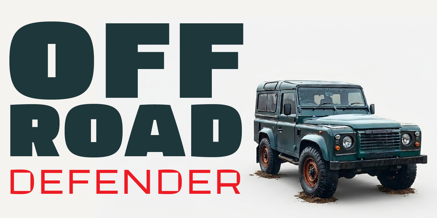
Bast was born from a single obsession: pushing a sans-serif to its structural limits. No optical corrections, no unnecessary curves — just flat terminals, clipped angles, and counters that become almost geometric voids. The result feels cast rather than drawn.
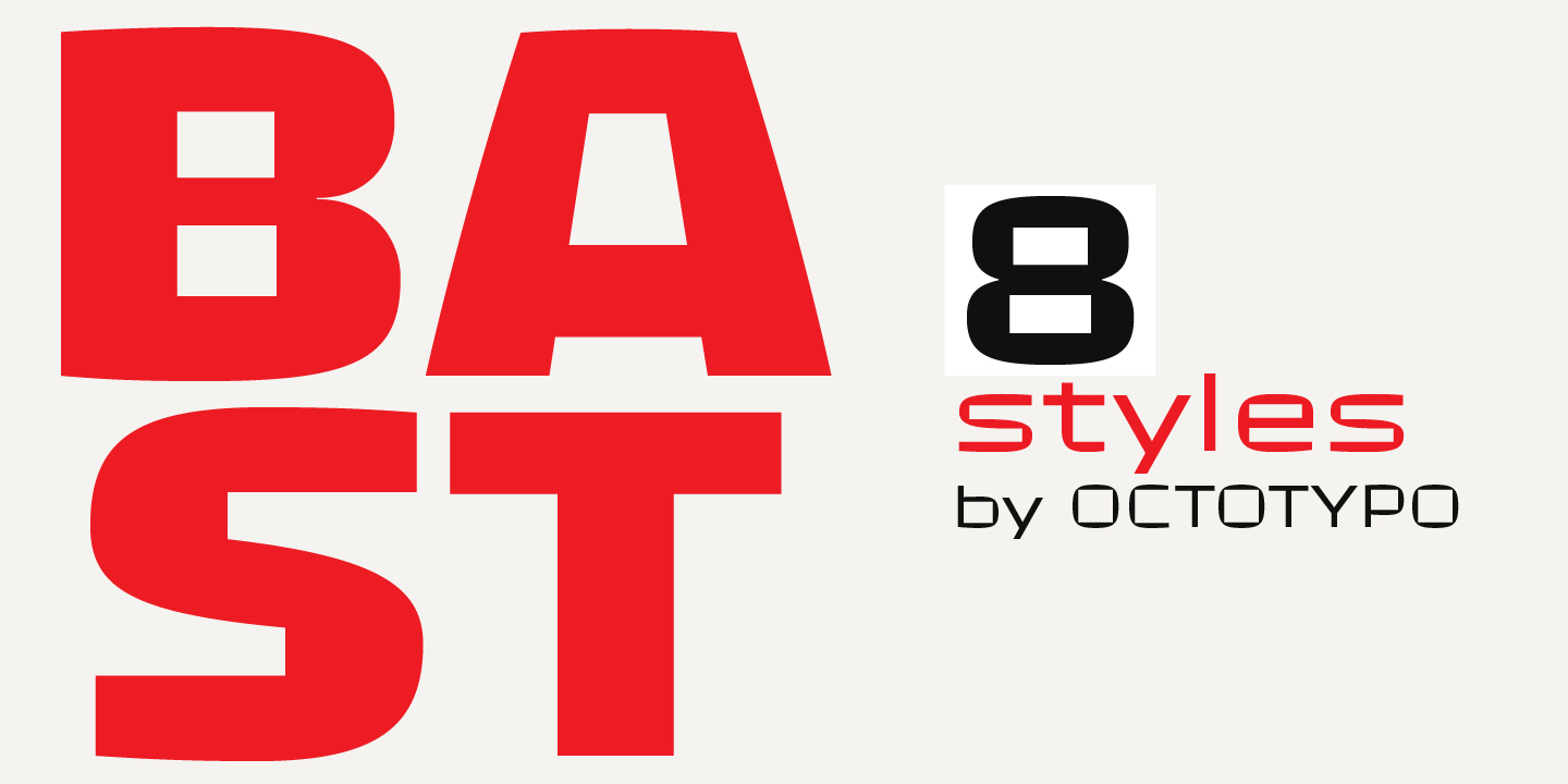
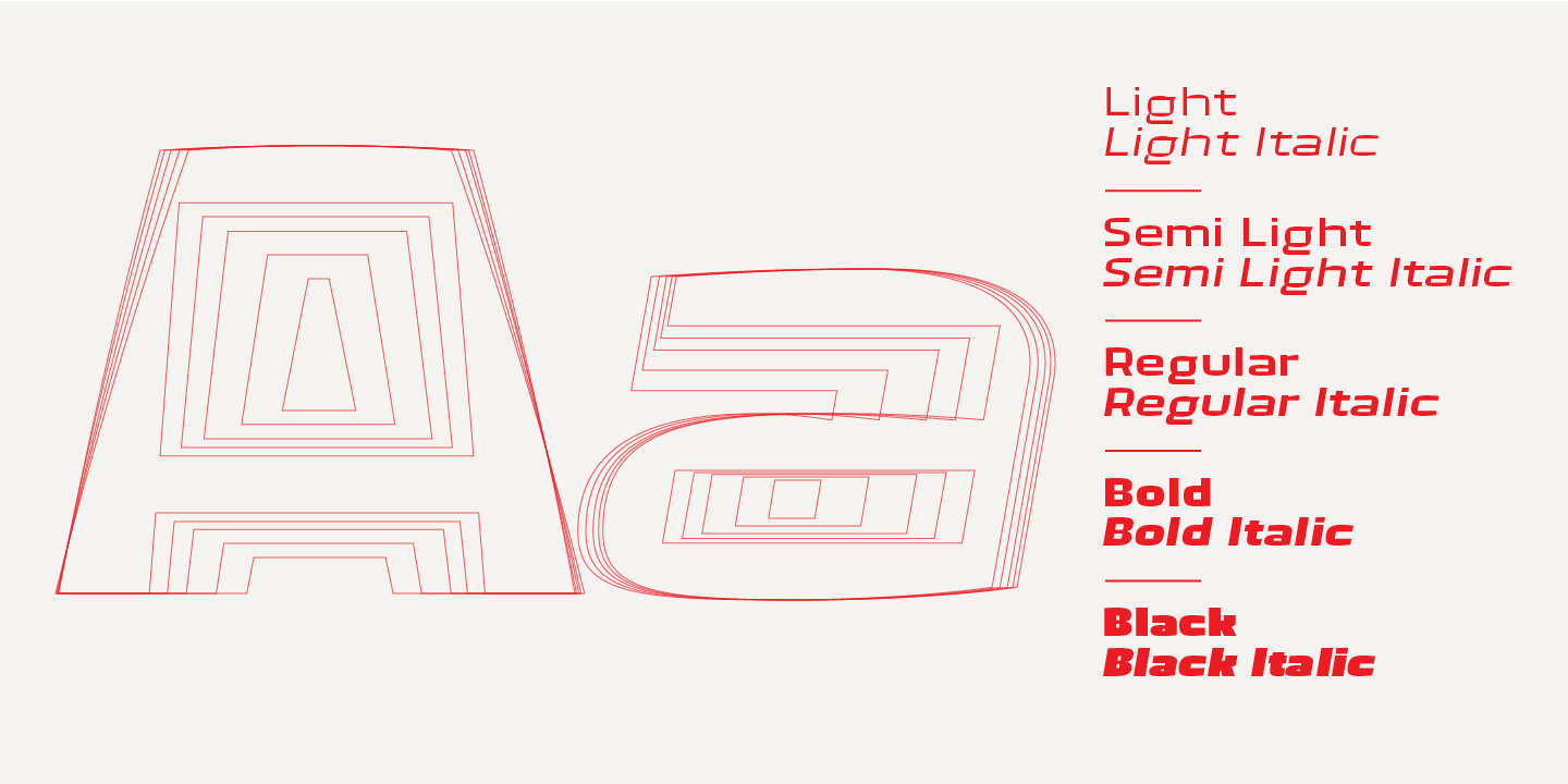
Within this apparent rigidity lives a subtle rhythm. The tapered uppercase A, the squared bowls of B and R, the deliberate abruptness of the S — enough personality to keep Bast from feeling purely mechanical, and to give it a voice that is immediately recognizable at large sizes.
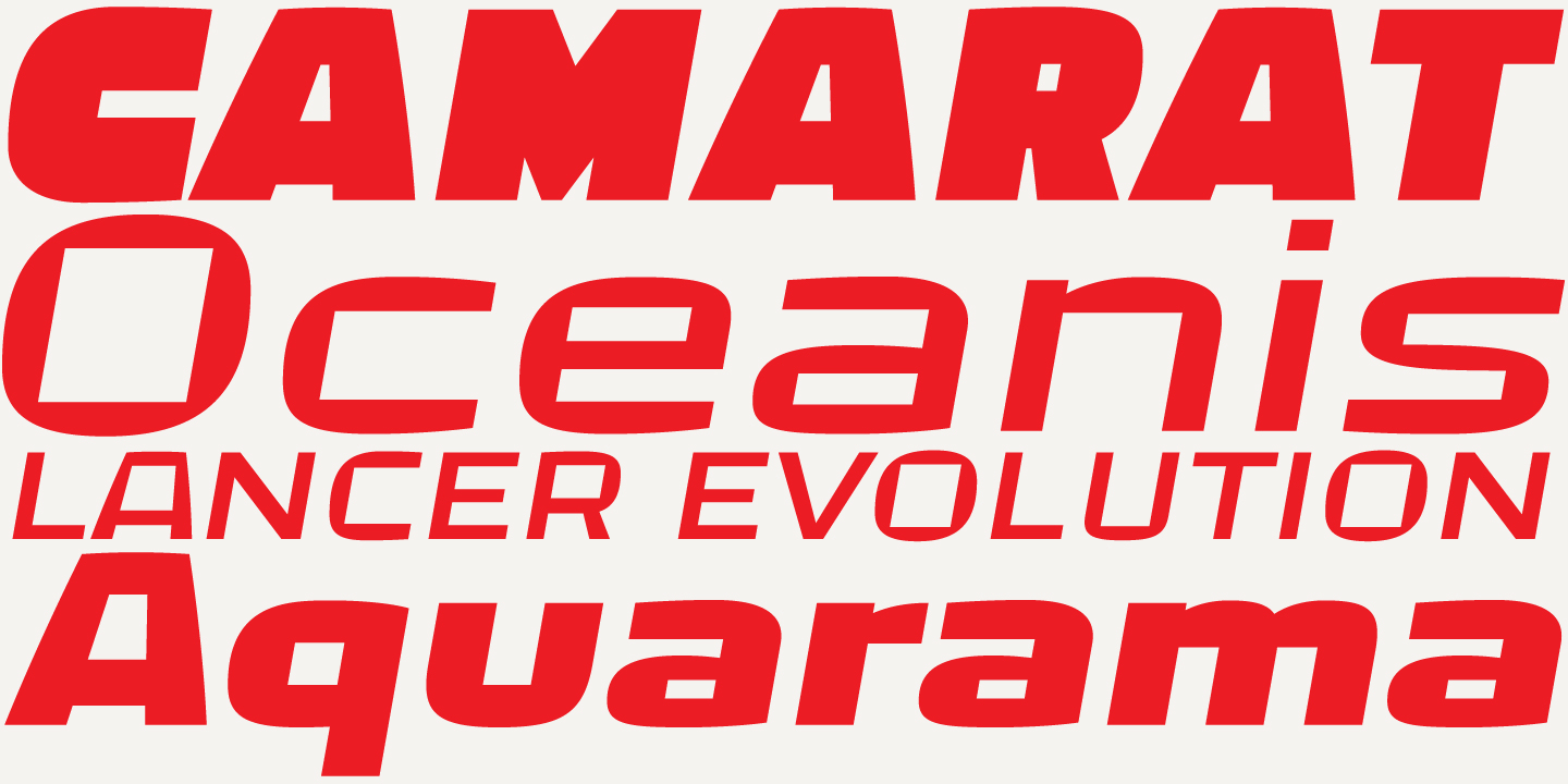
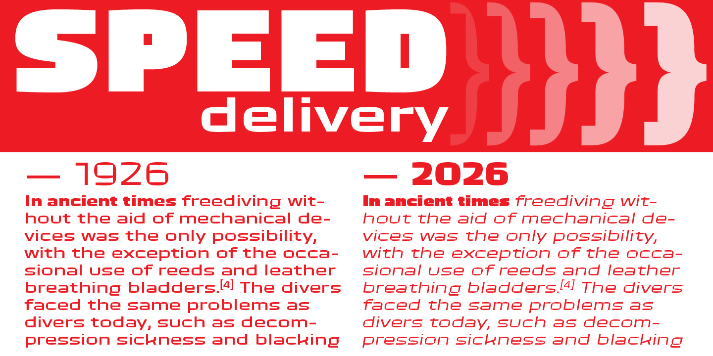
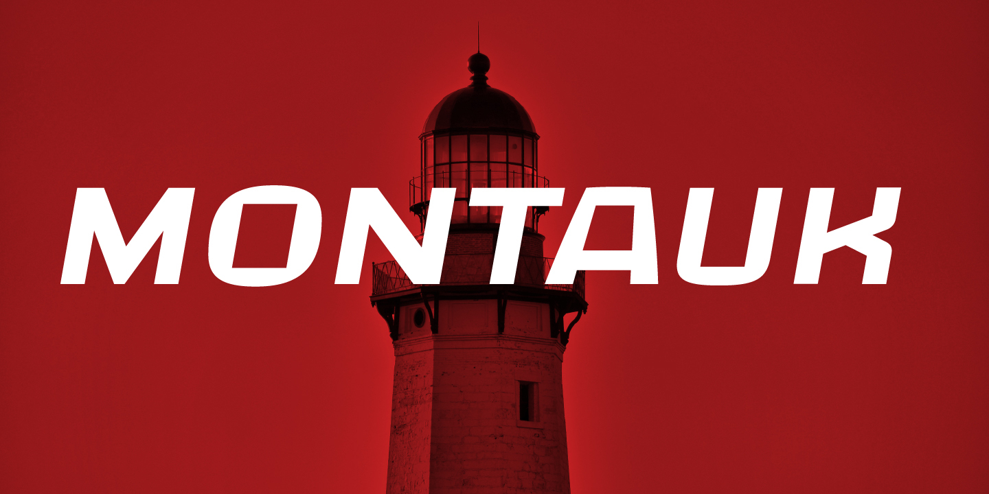
The italic cuts introduce a forward lean that goes beyond simple slanting, making them particularly effective when paired with the roman weights in poster or editorial contexts.
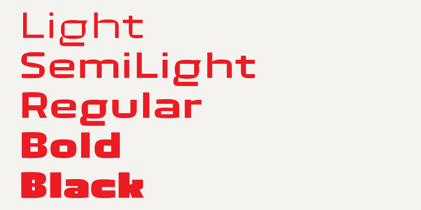
Five weights, Light to Black. Designed for headlines, logotypes, and anywhere the text needs to hold its ground.