Kalpa
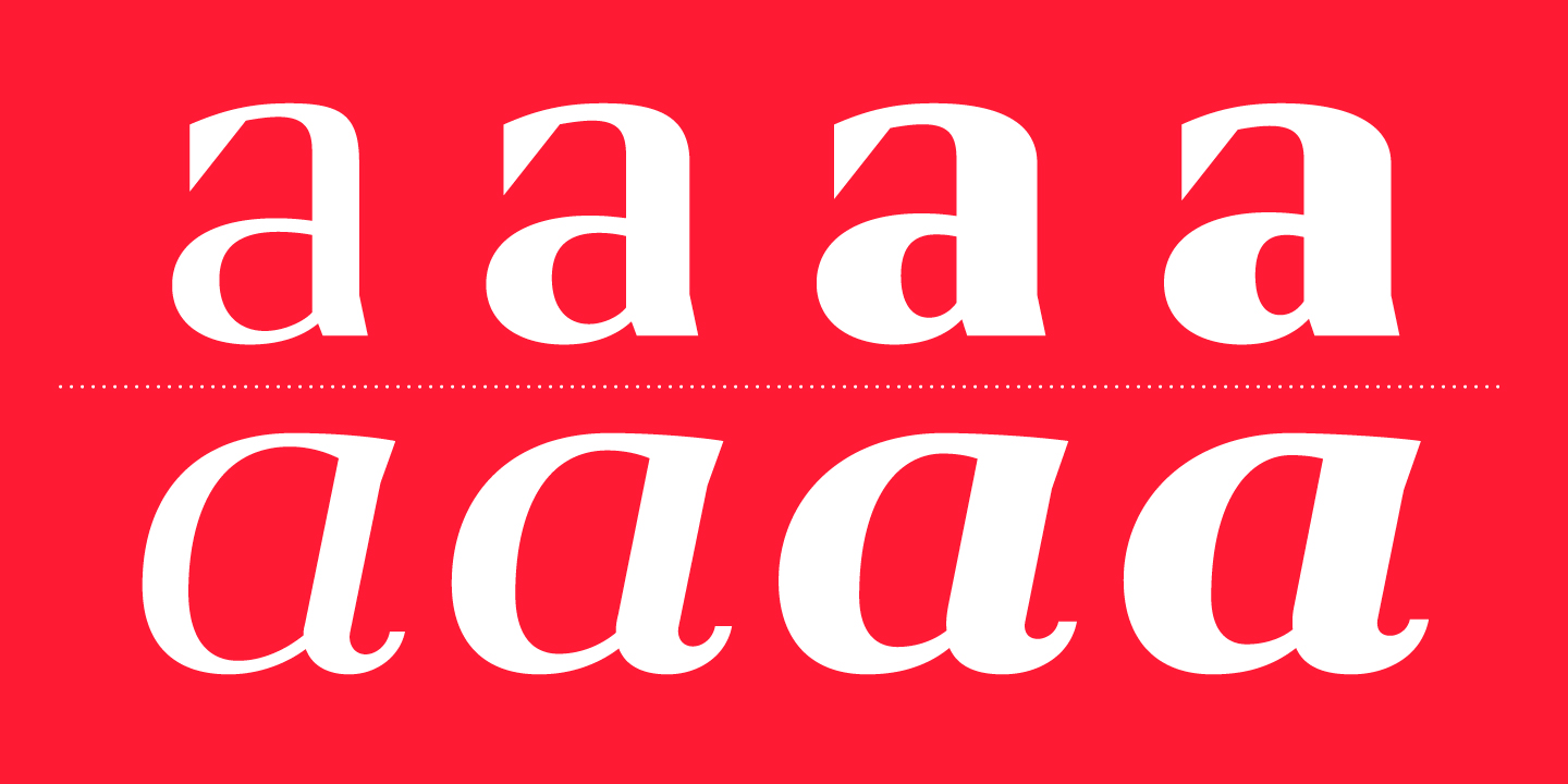
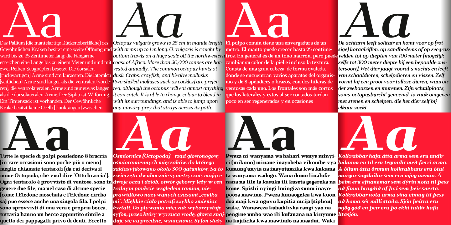
The early inspiration designs for Kalpa comes from some old wrist watches dials from an iconic diving watch company. The result is a sharp and sleek design that gives an extremely strong look to the font.
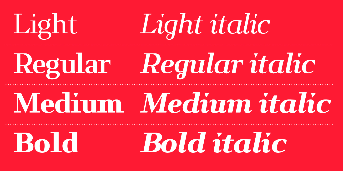
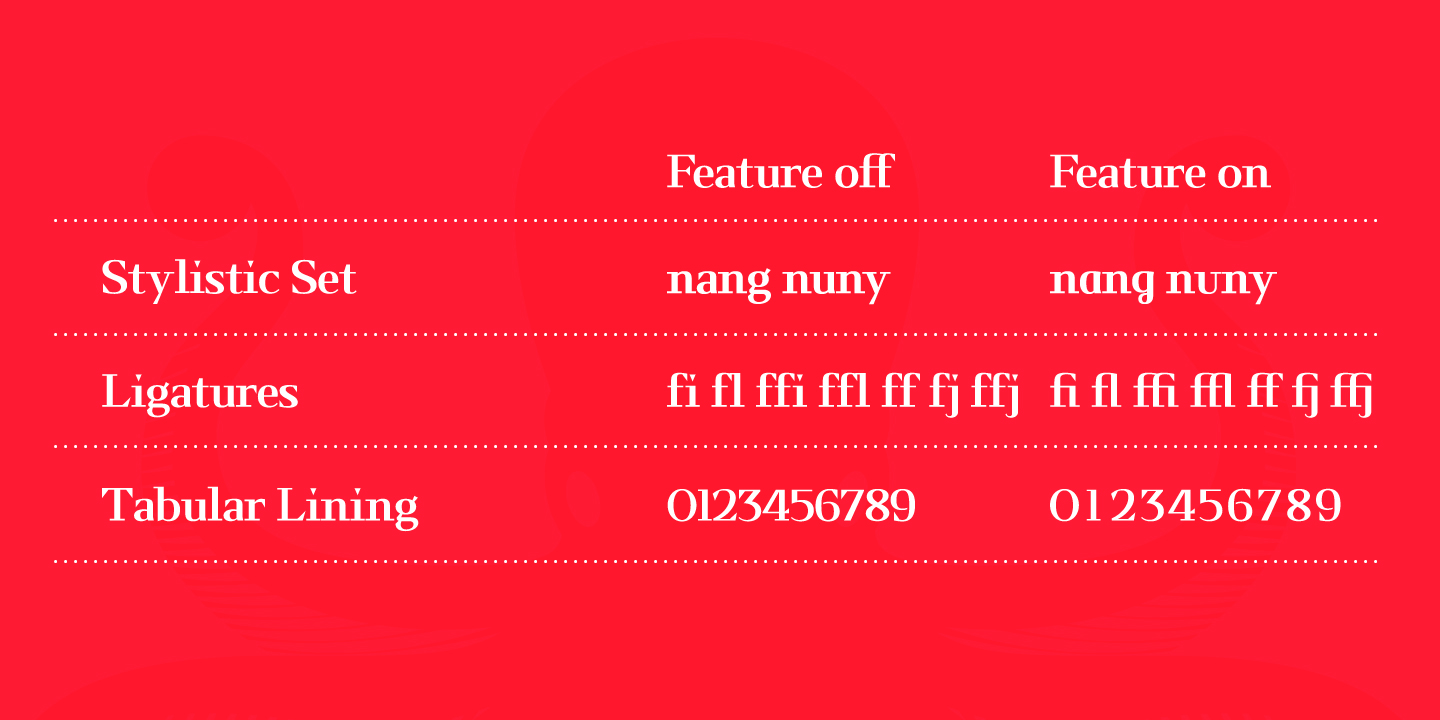
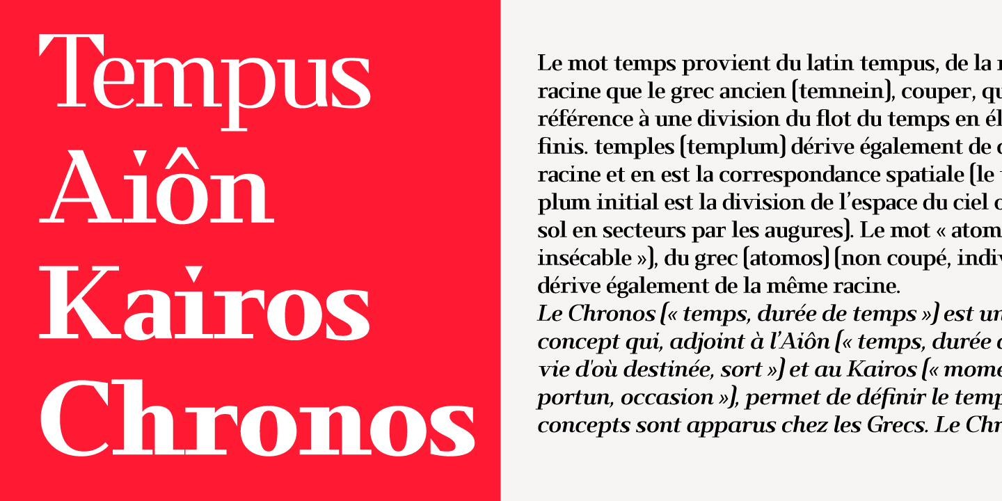
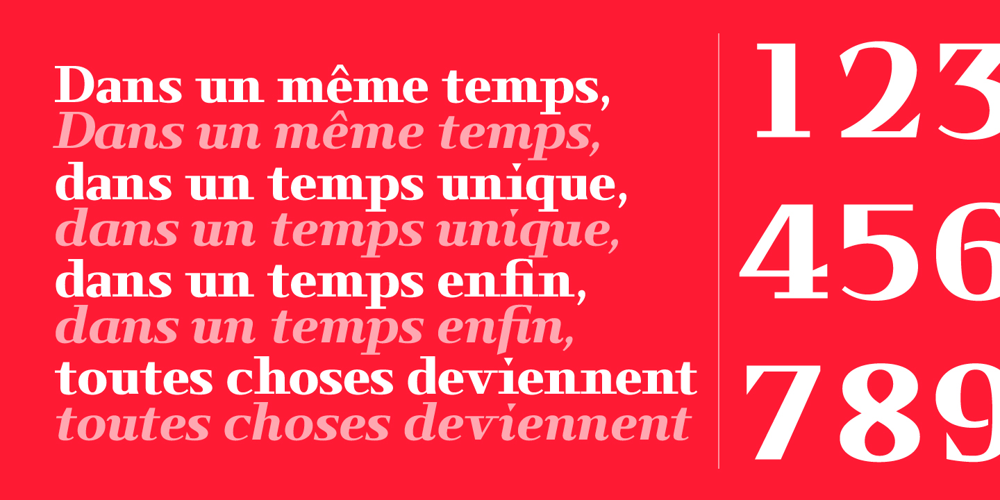
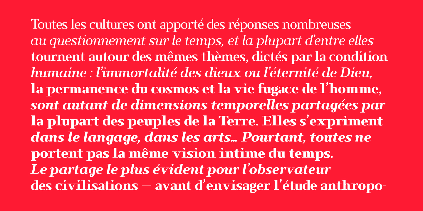
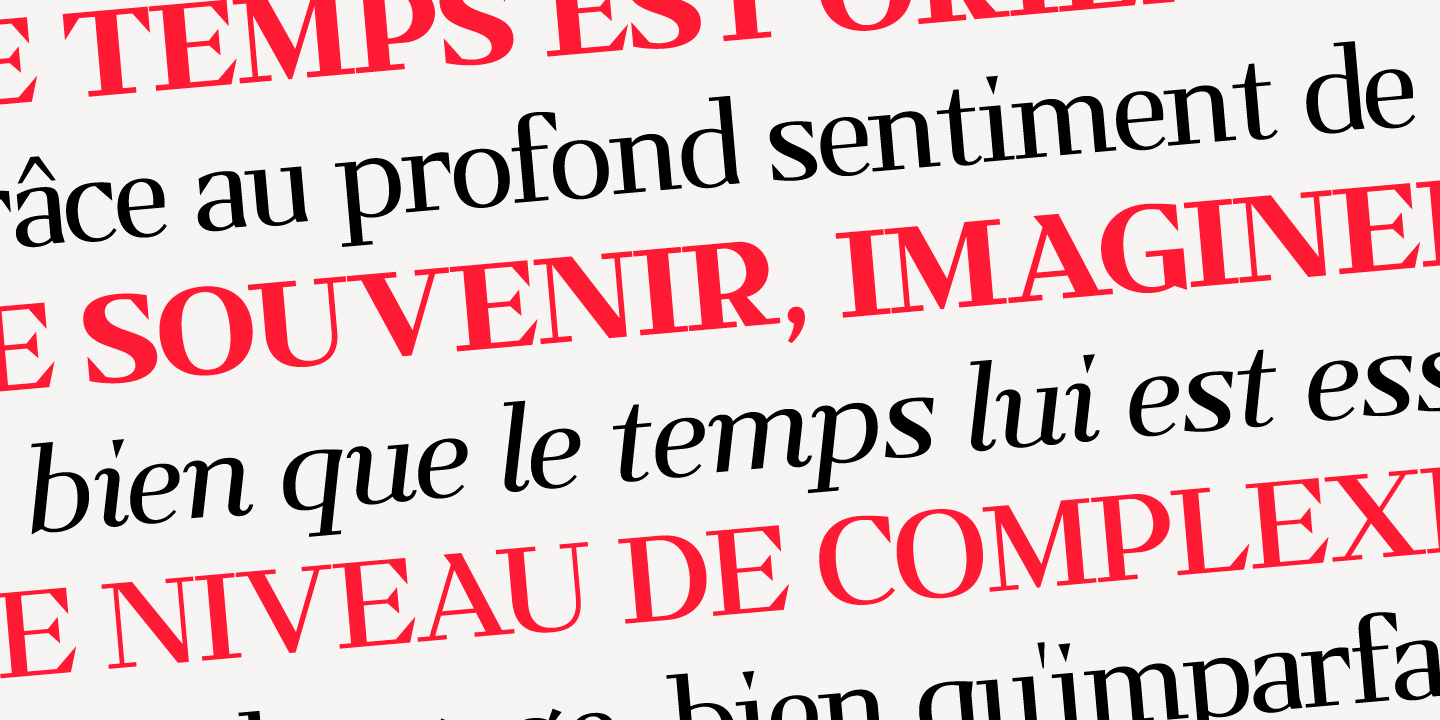
Kalpa comes in 4 weights and italics to make it versatile and easy to use on all kinds of media. It is a wise choice for headlines, logos, branding, packaging, publications and websites. The design comes with some alternatives glyphs which enhanced the use of the font and let you customise your letter works.
The name comes from a Sanskrit word meaning a relatively long period of time to connect with its early inspirations of wrist watches dials.
Kiwi ? Figue ? Débloquez vite ce pharynx, James
